Using the Visualforce Component Library
Up to this point, the only Visualforce tag that has been used in the examples is the mandatory <apex:page> tag that must be placed at the start and end of all Visualforce markup. However, just as you can insert images or tables into an HTML document with the <img> or <table> tags, respectively, you can add user interface components to your Visualforce pages using tags that are defined in the Visualforce component library.
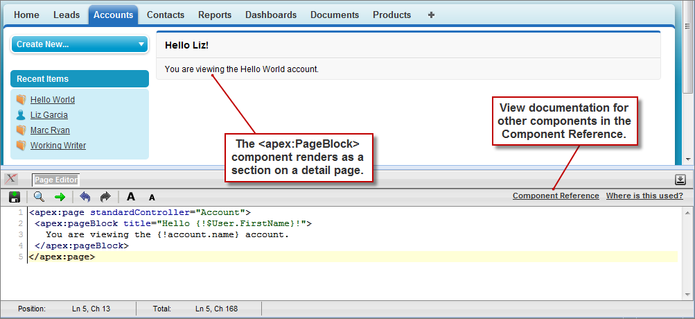
For example, to add a component that looks like a section on a detail page, use the <apex:pageBlock> component tag:
<apex:page standardController="Account">
    <apex:pageBlock title="Hello {!$User.FirstName}!">
            You are viewing the {!account.name} account.
    </apex:pageBlock>
</apex:page>
The <apex:pageBlock> Component
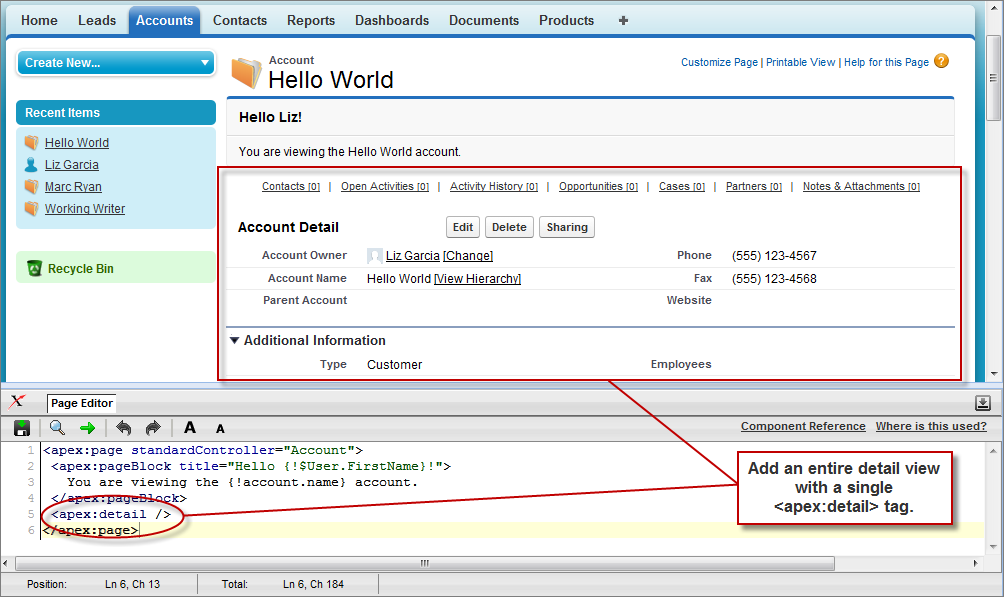
Tags also exist for other common Salesforce interface components, such as related lists, detail pages, and input fields. For example, to add the content of a detail page, use the <apex:detail> component tag:<apex:page standardController="Account"> <apex:pageBlock title="Hello {!$User.FirstName}!"> You are viewing the {!account.name} account. </apex:pageBlock> <apex:detail/> </apex:page>The <apex:detail> Component Without Attributes
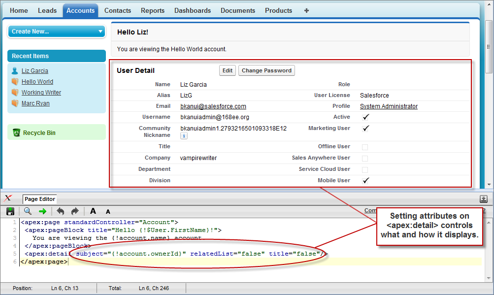
Without any specified attributes on the tag, <apex:detail> displays the complete detail view for the context record. If you want to modify properties such as which record details are displayed, or whether related lists or the title appear, you can use attributes on the tag. For example, the following markup displays the details of the context account's owner, without related lists or a colored title bar:<apex:page standardController="Account"> <apex:pageBlock title="Hello {!$User.FirstName}!"> You are viewing the {!account.name} account. </apex:pageBlock> <apex:detail subject="{!account.ownerId}" relatedList="false" title="false"/> </apex:page>The <apex:detail> Component Without Related List or Title ElementsIf a component is updated or edited, the Visualforce page that references it is also updated.To browse the component library, click Component Reference in the Page Editor. From this page you can drill down into any component to see the attributes that are available for each, including any custom components that you define.
No comments:
Post a Comment